Home / eaDocX Homepage / EaDocX Help / Matrix Reports / Matrix Report layouts
Matrix Report layouts
eaDocX provides two different styles of Matrix Report, to suit different kinds of data: Normal and Compact
Normal Layout
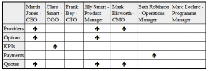
In the normal layout, the table is a standard 2d table, with Target element at the top, source element down the left-hand side:

Additional heading rows and columns may also be added: see source columns and target heading rows for more details.
Sometimes, the information you need in the top row may be too long to fit into the table, or there may be too many columns to fit across the page. For this, eaDocX has the Compact table layout.
Compact Layout
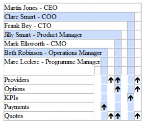
The Compact Layout work well where the target (top row) may be large, and make the table so wide that it won’t fit on a page. The table above would look like this when printed with a compact layout:

The blue shading has been added to help the reader find the correct column from the heading row, and is overridden by any conditional formatting.
Perhaps a little harder to read that the ‘Normal’ layout, but you can see how we could add many more people to the list, and the table will get longer, but not much wider. If you want to make your compact layout tables expand to have large numbers of target elements, they work best when the text which is printed in each cell is quite short. In the example above, we’re just printed the normal EA ‘arrows’.
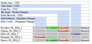
Compact layout tables can also use the same Conditional Formatting as normal tables:

Here, we have added some more columns to each source row: here, the Name and Alias attributes have been added, which print separated by ‘,’.